Tim Chen, the cofounder of the personal finance website, “NerdWallet,” once said that “opportunity is a graph. On one axis, it’s what you do, and on the other axis who you tell.” The point is that if, as you are doing more, you are able to tell more people about it, your prospects will improve.
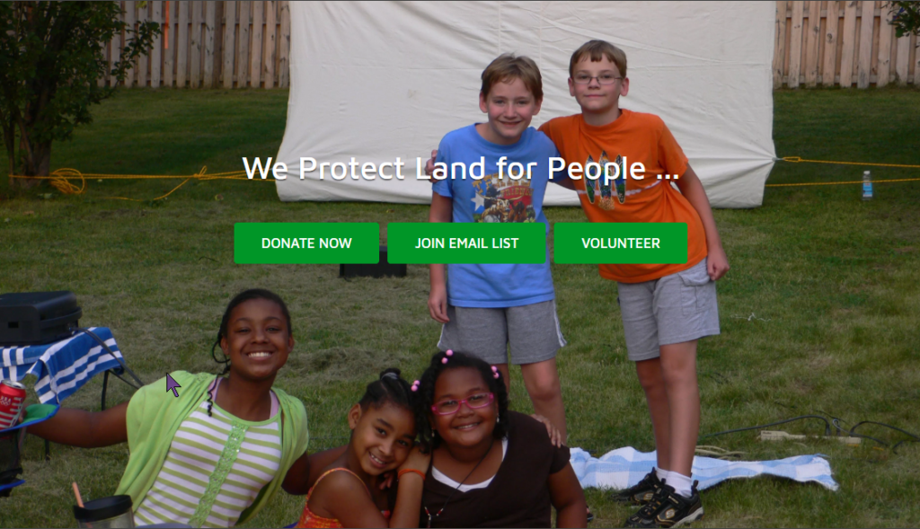
The maxim was in the back of my mind as NeighborSpace sought to redo its website this spring. For any small organization, a website is its communications hub. It’s where you drive traffic from email or social media campaigns to buy a product or, in the case of a nonprofit, make a contribution, volunteer for the cause, or learn more about an issue. And it’s the one place where you have an almost unfettered ability to tell your rich story about who you are, what you do, how you are unique, and the impact that you’ve made in the community that you serve. Do that well, supply enough traffic, and your connections with your audiences will improve, at least that’s the theory.
That’s what NeighborSpace hoped would happen when, on March 19, its new website launched, complete with Google analytics, a tool for evaluating its effectiveness.
There’s been a steady uptick in traffic since that time. Pages that may be of interest to you include:
- About, where we describe the history behind the challenges to livability that exist in side the URDL and our model for addressing them. There’s also a subpage with short bios about our staff and board and a link to our financials;
- Sites, an evolving page that will soon have an interactive Story Map about our 20 sites;
- Projects, a page with information about the advocacy issues, programming, and site development projects that we are working on currently;
- Resources, an evolving page with descriptions and links to resources for our stewardship partners;
- News, a page that will soon contain all of the articles that have appeared in our monthly newsletter for the last several years, along with most of our press releases; and
- Events, a page with our calendar of social and volunteer events.
The website color scheme depends heavily on gray and green, two hues that lie at the heart of our mission of improving livability inside the URDL. That got us thinking that we really needed to update our logo along those same lines. So, below is the "spring-cleaned" NeighborSpace logo:

These projects were done in-house, with only small expenditures for software licenses, and with an eye toward simplifying both the website user experience and our ability to keep content fresh. Leave a comment below to tell us what you think.
